Every business relies on their branding (visual and beyond) to communicate their story and values to the world. But, I don’t think it’s a stretch to say that creative businesses rely on their brand and brand voice EVEN MORE.
So when I set out to create the visual language for my wedding stationery business, I focused on designing pieces that reflected what I stood for, who I was , and who I wanted to be.
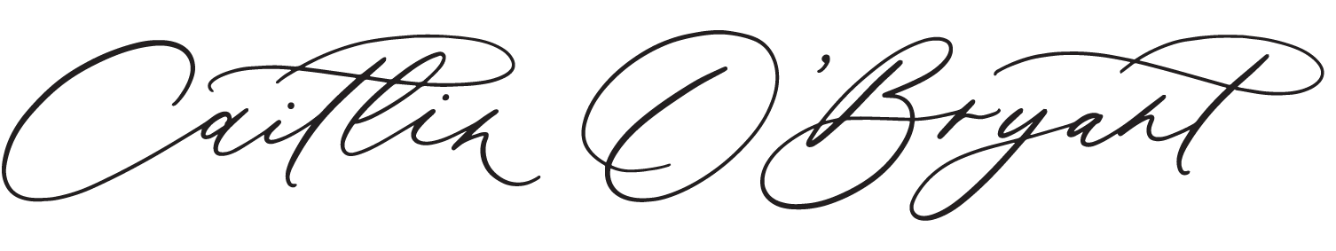
The Logo
While there is much more to brand than the logo, the logo is heart of it all, and sets the tone for everything to come.
Moving into this new chapter of my business, I wanted a design that highlighted my emphasis on clean, memorable, hand-crafted designs. Sketching and polishing each letter one by one, I created a timeless and classic hand-drawn serif logo.
To give the design more movement and a hand-crafted feel, I broke the grid with the letter “R” in my last name, extending its tail past the baseline and having it swish down and past the next letter.
Finally, I created a custom texture as a mask for larger, high-res versions of the logo.

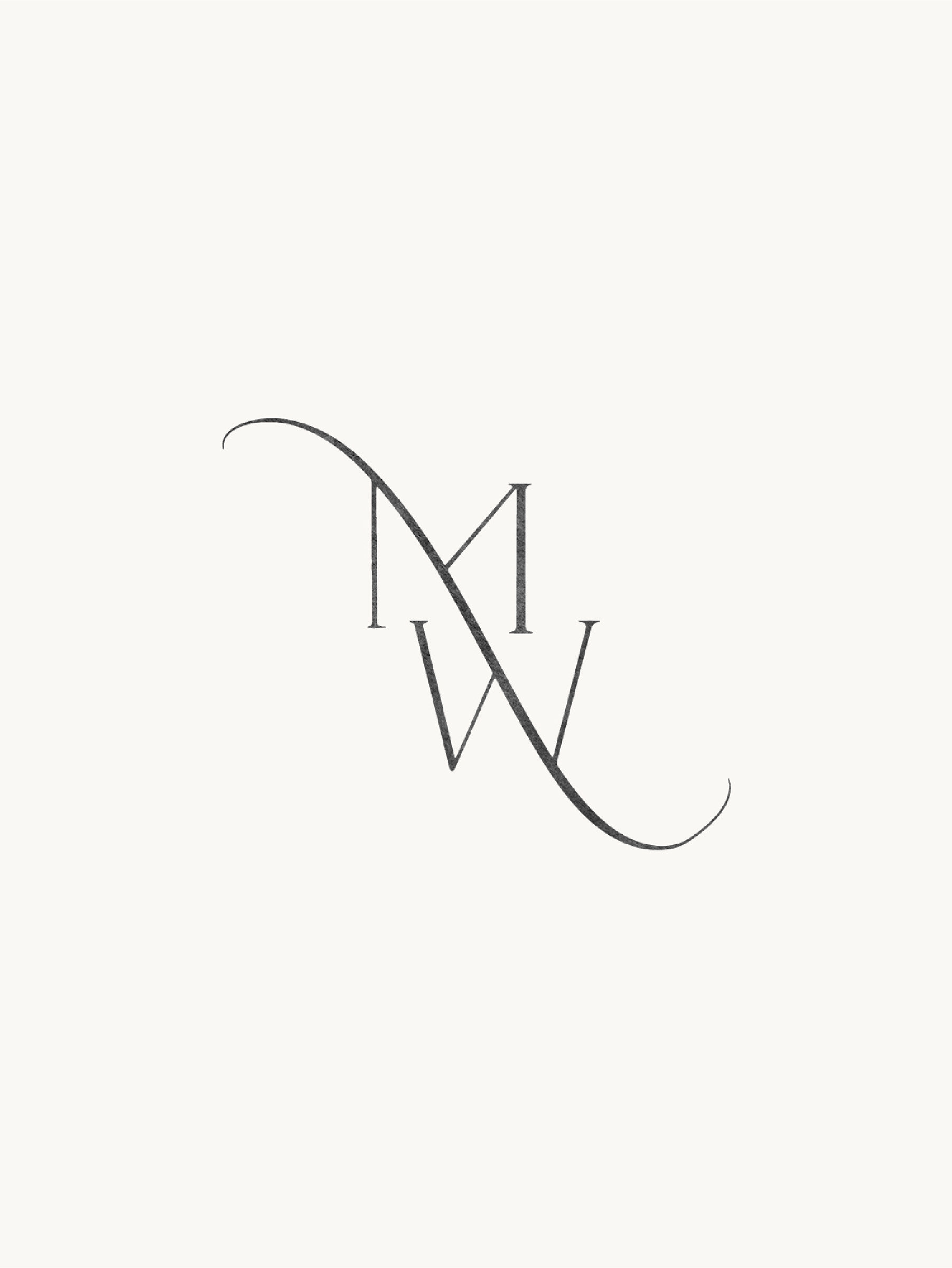
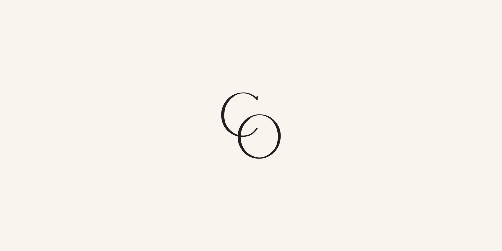
The Submark
A submark is a small detail, but one that, when done right, makes a big difference in a brand. It shows the attention to detail, and gives audiences complete, immersive experiences. It also shows the flexibility of the logo and branding in general.
I wanted the submark to have some dimension and movement, but it also needed to be clean and simple, so it was easily viewable at a small size, like in a web browser tab. A minimal overlap of the “C” and “O” did the trick!
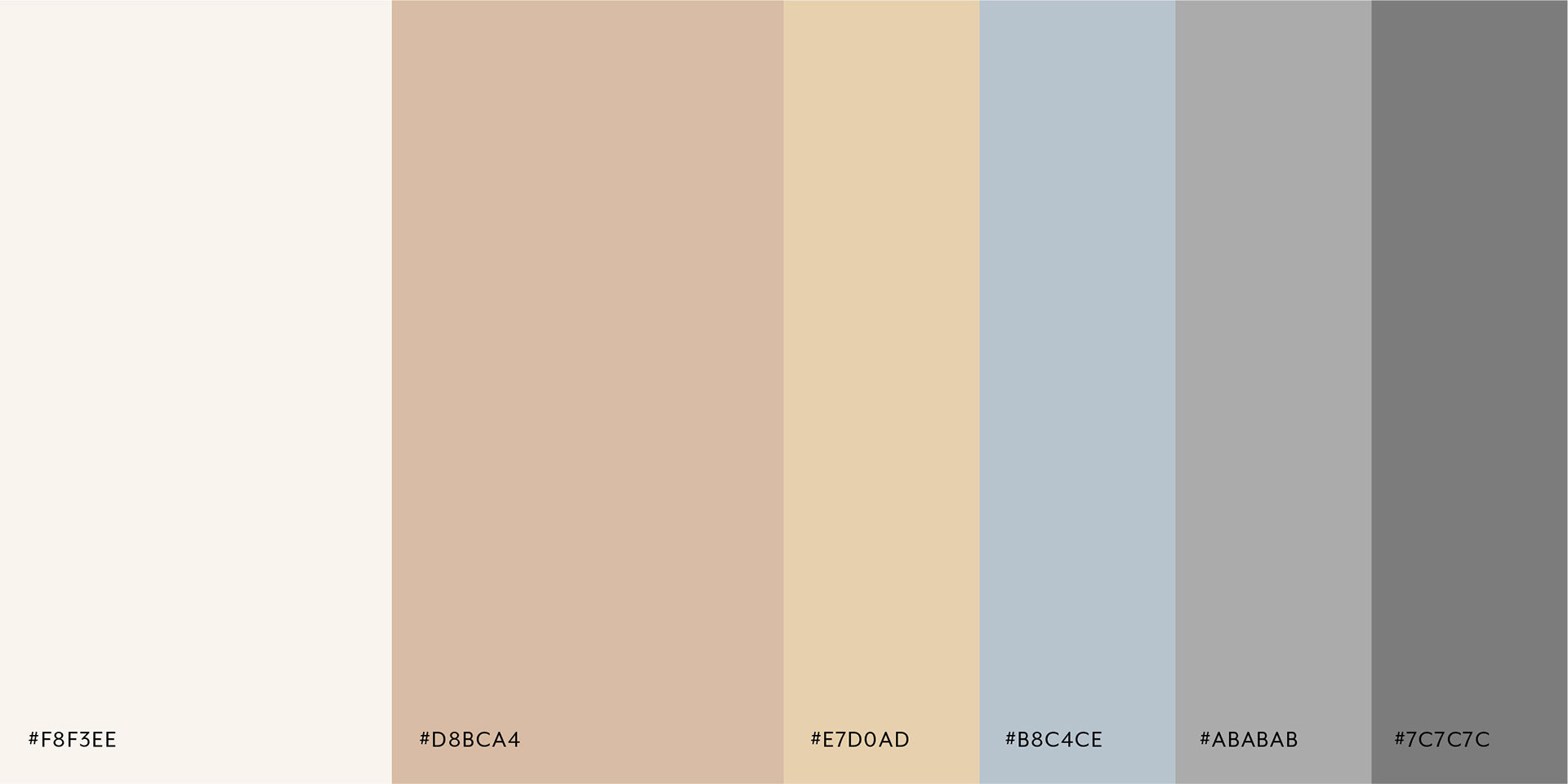
The Color Palette
Color is SO important in communicating tone, emotion, and values, and choosing the palette was a huge part of my brand design.
I wanted things to feel natural and clean, but also warm and approachable. And because each couple and client would bring their own wedding colors to the table, the base palette needed to be something they could envision supporting their own personal style.
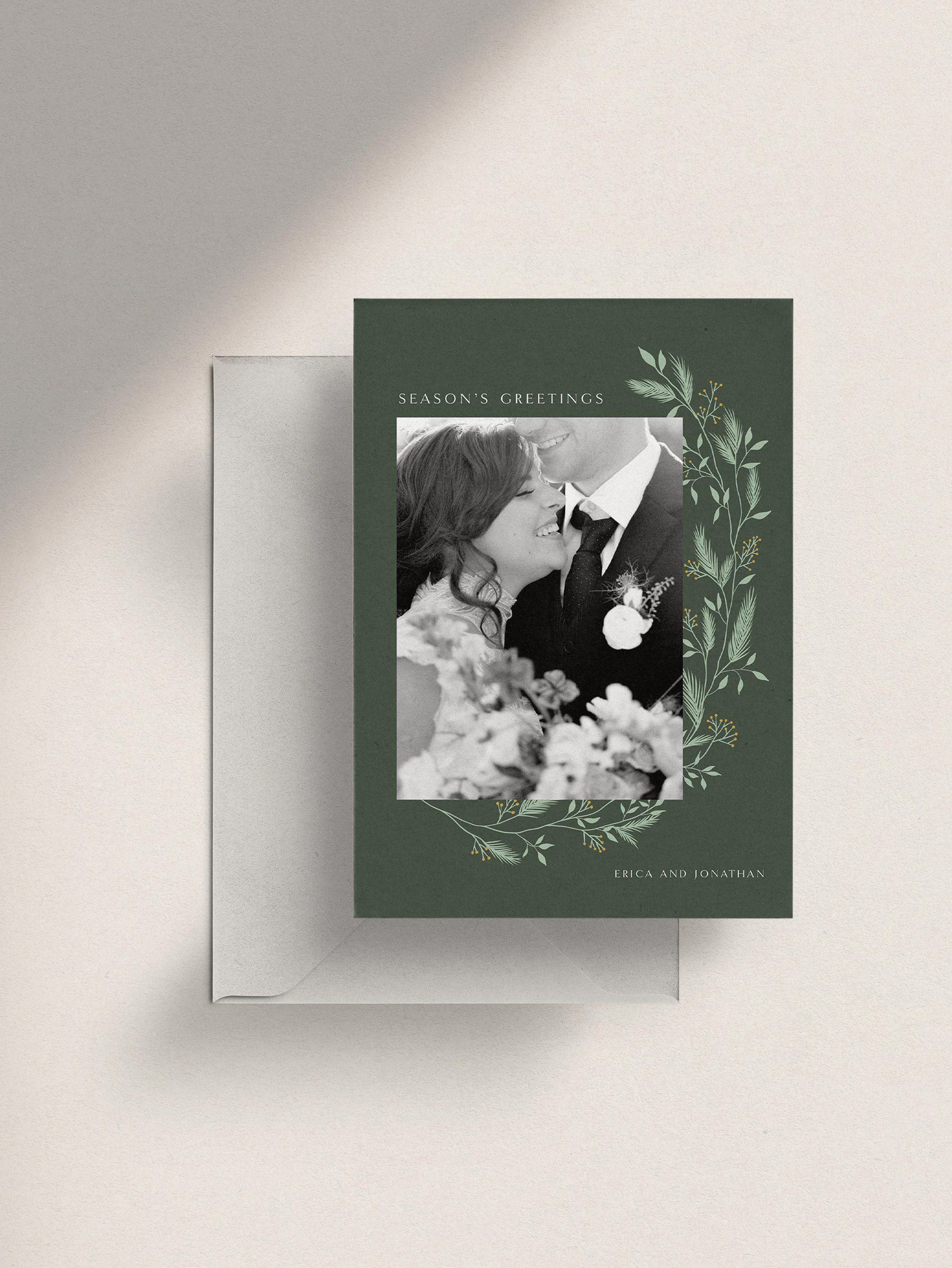
After much deliberation, I chose several warm neutral tones for the primary palette, and grounded them with variations of grey. Then, when I need to add a bit more of my own personality, I include small accents of slate blue and a dusty, wheat color.
I view the color palette as a living, breathing entity within my brand. The details of it can change and ebb and flow as needed for the mood and tone of whatever I’m producing, and still use the warm neutrals and greys to tie things in to the larger brand.
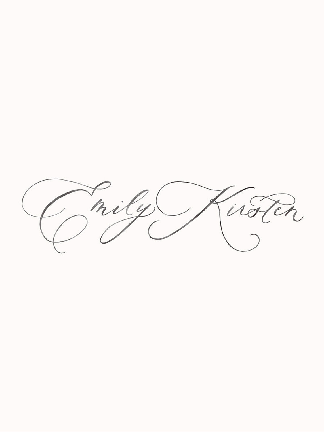
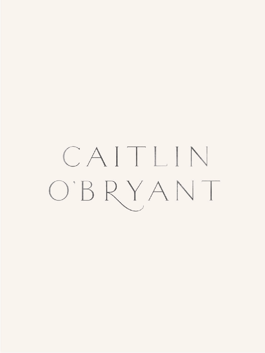
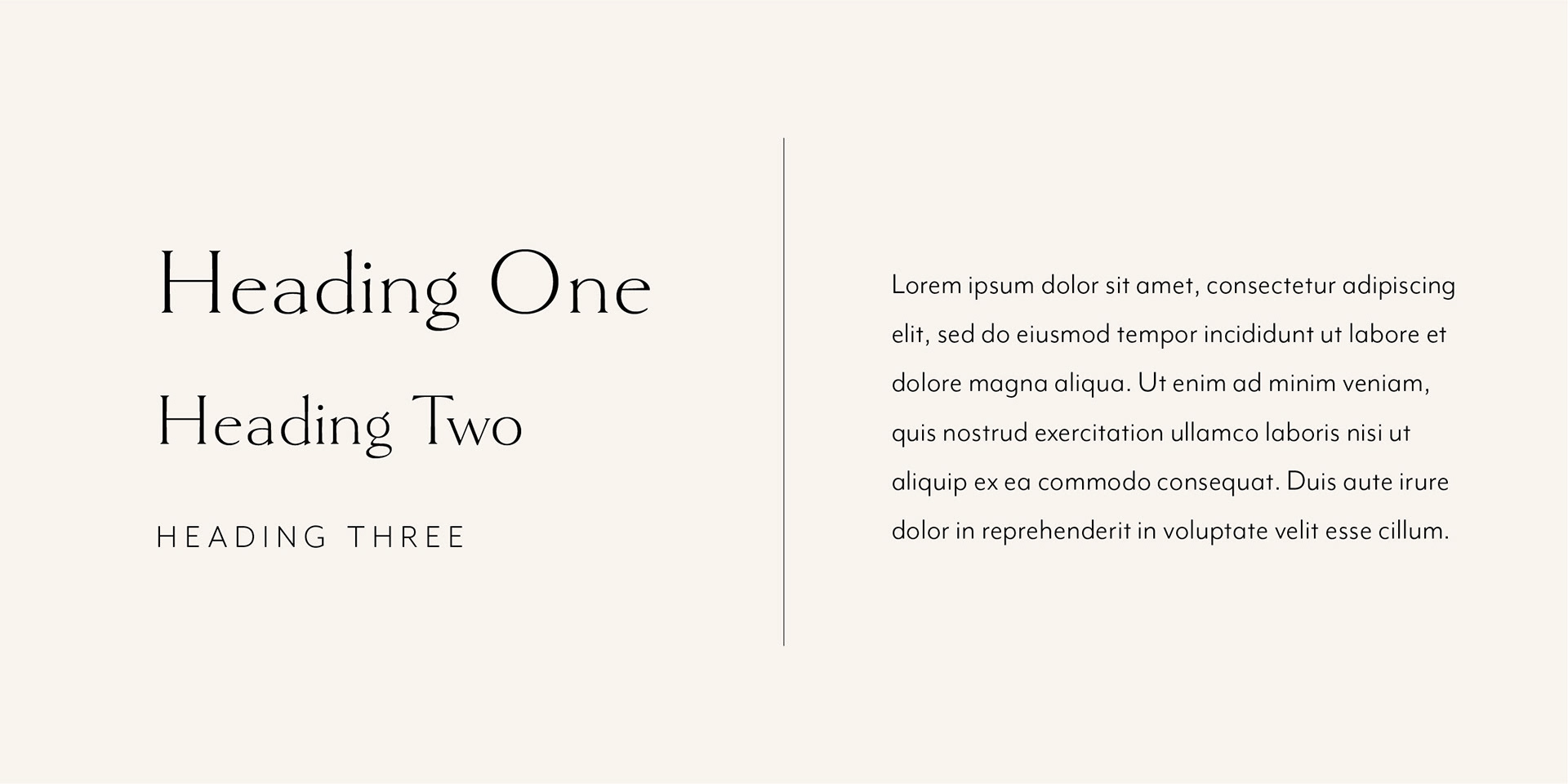
The Type Palette
A type palette is arguably the most present part of a brand design. It shows up EVERYWHERE. And while it might not be as recognizable or unique as the logo or the color palette, it’s just as important to communicating tone.
It’s just sneakier about it.
So, when figuring out my typography choices for the brand, I searched for fonts that brought a combination of readability and polished character—something that had a human feel, but was still clean and minimal.
For larger headers, Goldenbook Light was perfect! The minimal serifs and character balance was just the right touch of “human.” I particularly love the two-story lowercase g’s. And Mr. Eaves is one of my favorite choices for clean body text. It’s super readable, but doesn't feel overused or calculated. Just the right balance of practicality and character.
Other Work for Caitlin O’Bryant Design
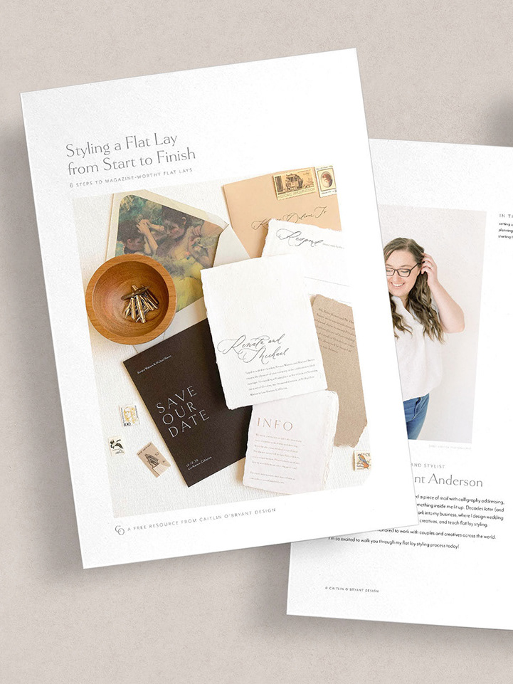
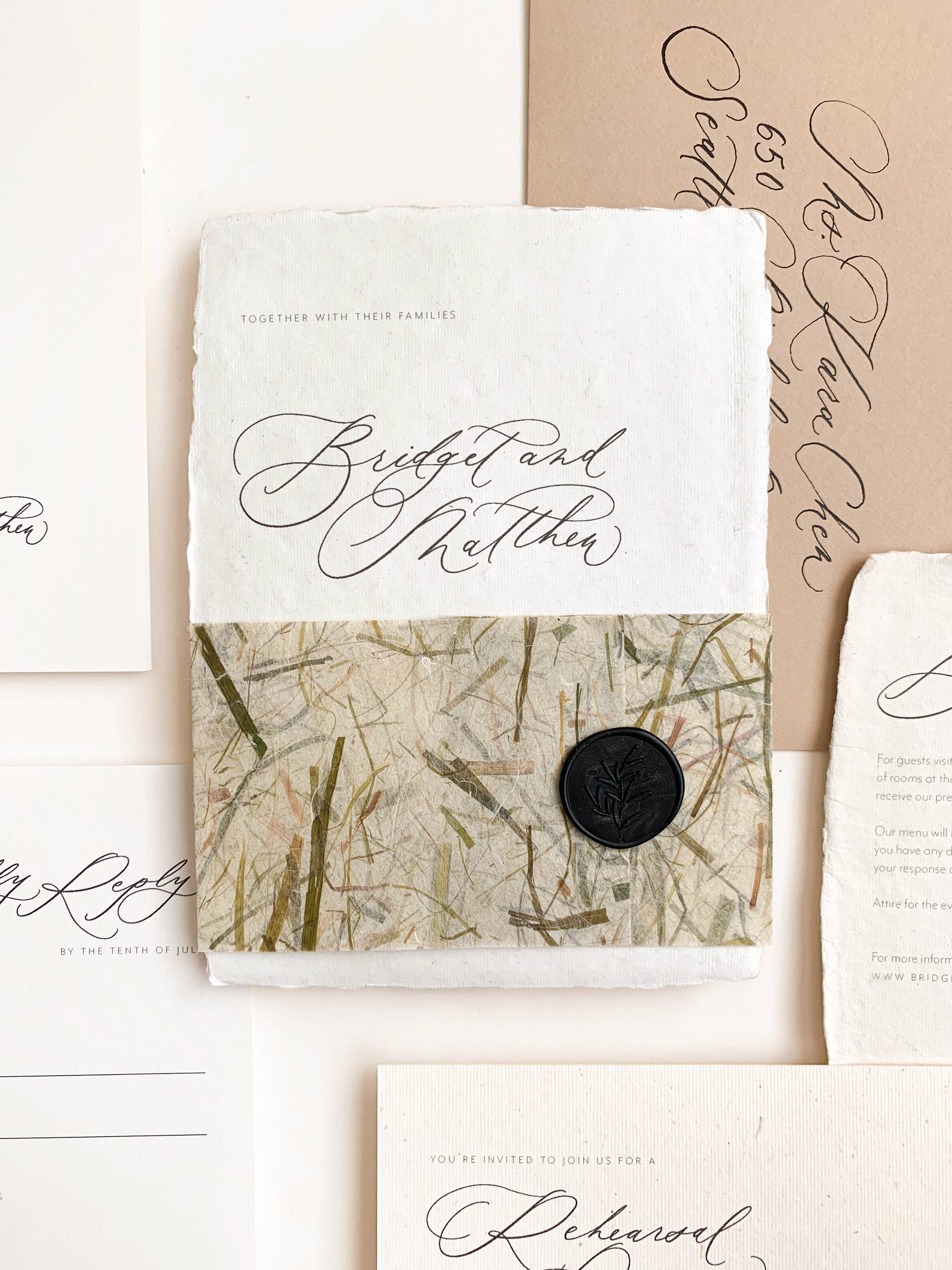
The brand is just a small sliver of the design work that goes into a creative small business. I’ve included some of the pieces I’ve designed for Caitlin O’Bryant Design on the other portfolio pages below.