I first worked with Mylyn on a photoshoot in the fall of 2018, and was completely blown away by her work. I absolutely love her approach to photography and her business: genuine care, artful attention, and heirloom quality. These values are so apparent in her work. She believes in feeling a photo, creating images that spark life and show the full experience of that moment. Her photos truly breathe and live.
She approached me, asking for a new logo that supported those values—something with both strength and elegance, and a few wisps of romance. She also really wanted to pull away from a calligraphy logo, in part because she wanted something that stood out a little more, and also because she wanted something that felt more fluid with the two y’s in her name.
Initial Brand Explorations
Before beginning logo sketches, I wanted to discuss the overall mood she was looking for in her brand, so we developed a mood board that explored color, texture, and character. From there, we were able to discuss how that mood could translate into a logo.
Sketches and Explorations
We went through several rounds of exploration, trying out different type styles: serif or sans-serif, high or low contrast, close or wide tracking, etc. Because the logo was hand-drawn, nailing down the style and feel of letter she wanted was the first priority.
Revisions
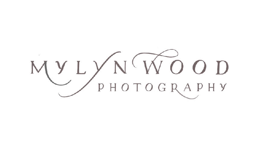
With the style of lettering determined, we began to play with different layouts and type characteristics. Mylyn chose the final direction and we cleaned it up to create the final logo.
Final Logo and Submark
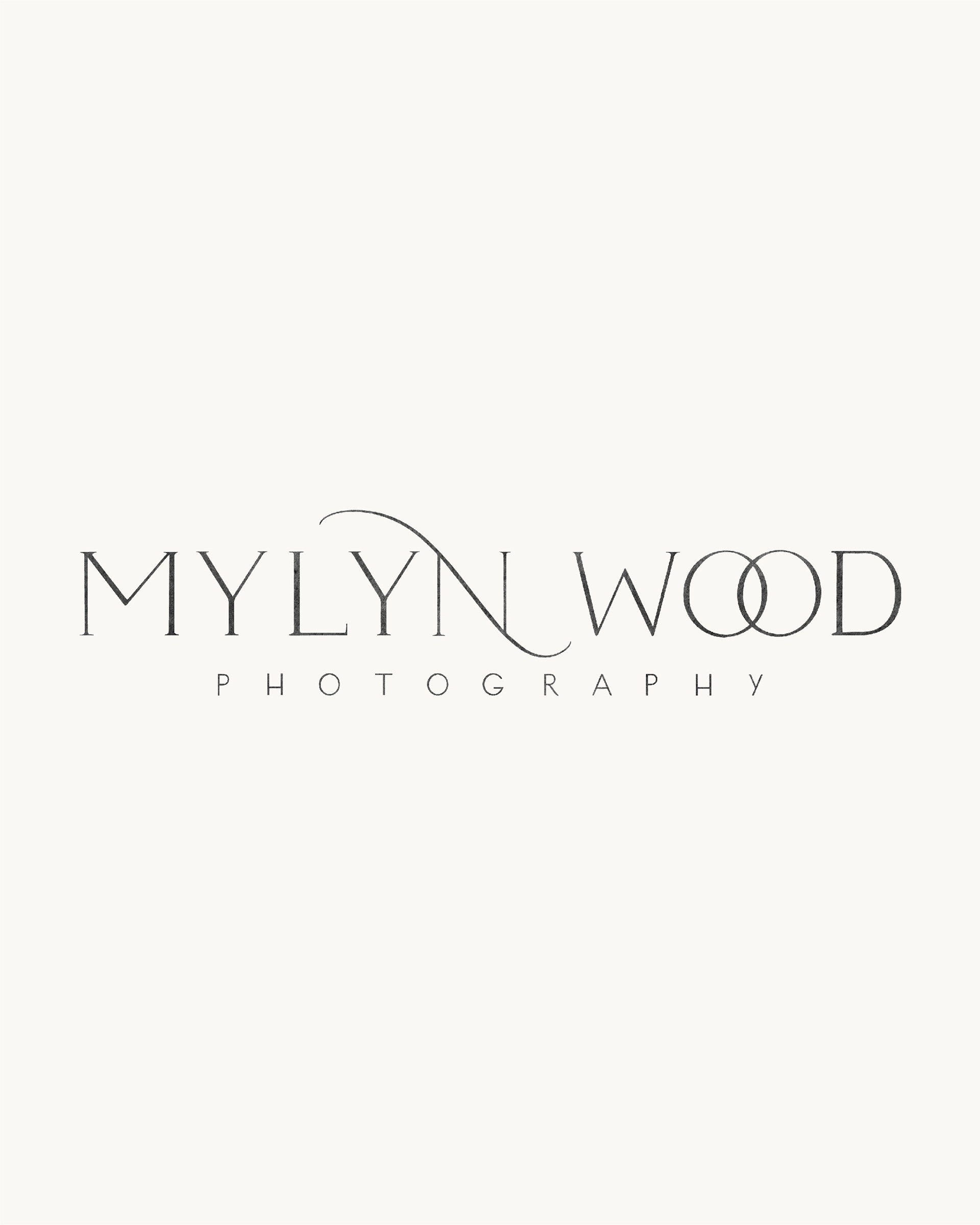
The final logo uses a serif type, slightly tracked out, which brings strength and timelessness. The hand-drawn touch adds a sense of character and time into the end result. We added a subtle charcoal texture, in addition to the flourished N and quirky Os, which gives the logo that touch of romance.
Brand Icon Design
After the initial brand was designed, Mylyn came back and wanted to do a small expansion in the form of a brand icon! With plans to use it on heirloom packaging for her photography clients and branded stationery, she wanted something that was unique, expressive, and reflective of her heritage and time growing up in Saipan.
After exploring a few different subjects (the sampaguita flower, calamansi fruit, and gingko leaves), Mylyn decided on the sampaguita flower for the final direction. We used an illustration style reflective of traditional Asian woodcuts to pull through the meaning and expression she was dreaming of. The contrast in negative space throughout the flowers reflects her specialty in working with multi-cultural weddings, as well!

